Executive Performance Dashboard

Southwest Airlines

Lead UX Consultant

Reimagined executive performance reporting by transforming static Tableau reports into a live decision-support platform for leadership.

southwest airlines executive dashboard mockup

Project Details

Project Details

Client

Southwest Airlines

Role

Lead UX Consultant

Industry

Aviation

year

2023

Duration

6 months

Client

Southwest Airlines

Role

Lead UX Consultant

Industry

Aviation

year

2023

Duration

6 months

Team

Executive Leadership • Product • Tableau Engineering • Business Intelligence • Business Analysts

Tools

Figma, Tableau, Design Systems, Data Visualizations

Team

Executive Leadership • Product • Tableau Engineering • Business Intelligence • Business Analysts

Tools

Figma, Tableau, Design Systems, Data Visualizations

Executive Summary

Southwest Airlines relied on static PDF exports from Tableau to communicate operational performance to executive leadership. This manual reporting process slowed decision-making, limited data exploration, and required analysts to spend significant time preparing reports for leadership meetings. As Lead UX Consultant, I helped redefine executive reporting by designing an interactive dashboard experience focused on enabling faster, more informed business decisions rather than simply presenting data.

Southwest Airlines relied on static PDF exports from Tableau to communicate operational performance to executive leadership. This manual reporting process slowed decision-making, limited data exploration, and required analysts to spend significant time preparing reports for leadership meetings. As Lead UX Consultant, I helped redefine executive reporting by designing an interactive dashboard experience focused on enabling faster, more informed business decisions rather than simply presenting data.

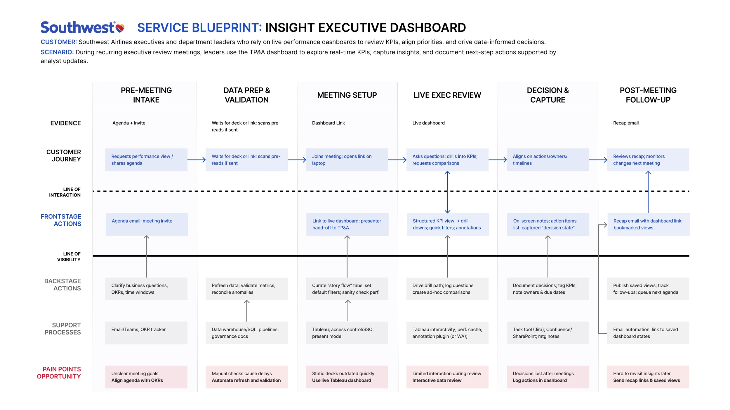
swa service blueprint
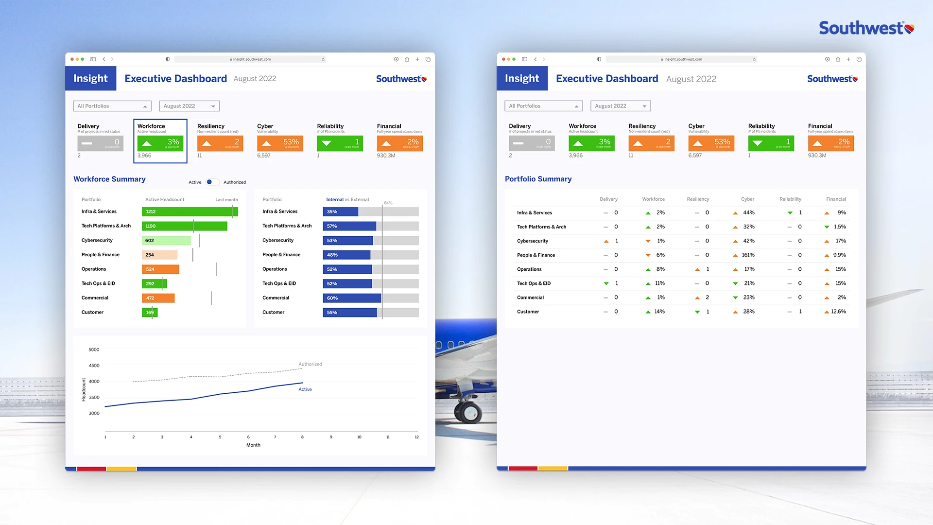
swa dashboard mockup
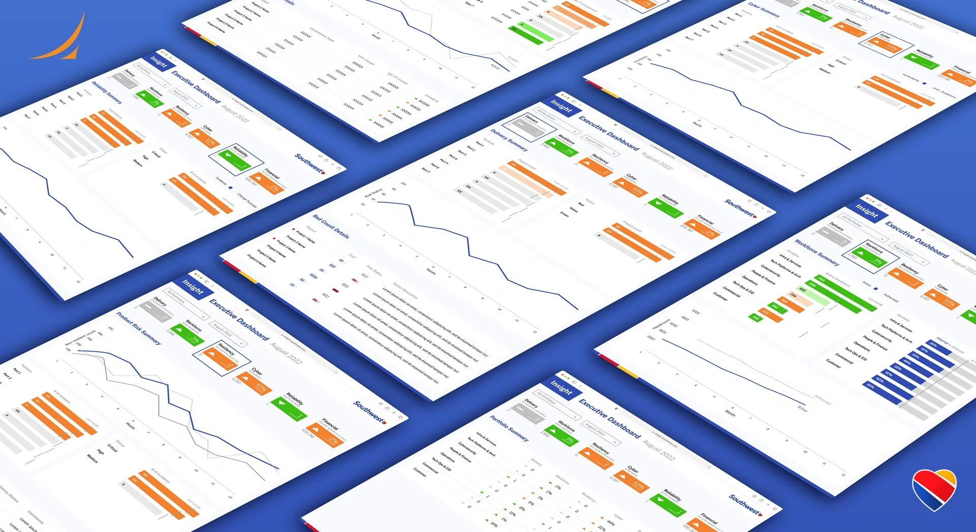
swa dashboard mockups

challenge

Executive stakeholders needed immediate access to trusted operational insights, but existing reporting workflows required manual preparation and lacked the flexibility needed for real-time discussions. The opportunity wasn't simply improving dashboards—it was redesigning how leadership consumed performance data across the organization.

strategic decision

Rather than redesigning individual reports, I focused on the broader decision-making workflow. Working closely with executives, business analysts, and Tableau engineers, I identified where information architecture, hierarchy, and interaction design were preventing leaders from quickly understanding organizational performance. The dashboard was intentionally structured around executive questions rather than underlying datasets, allowing leadership to move naturally from high-level KPIs into supporting operational detail without losing context. This shifted reporting from a static presentation into an interactive decision-support tool.

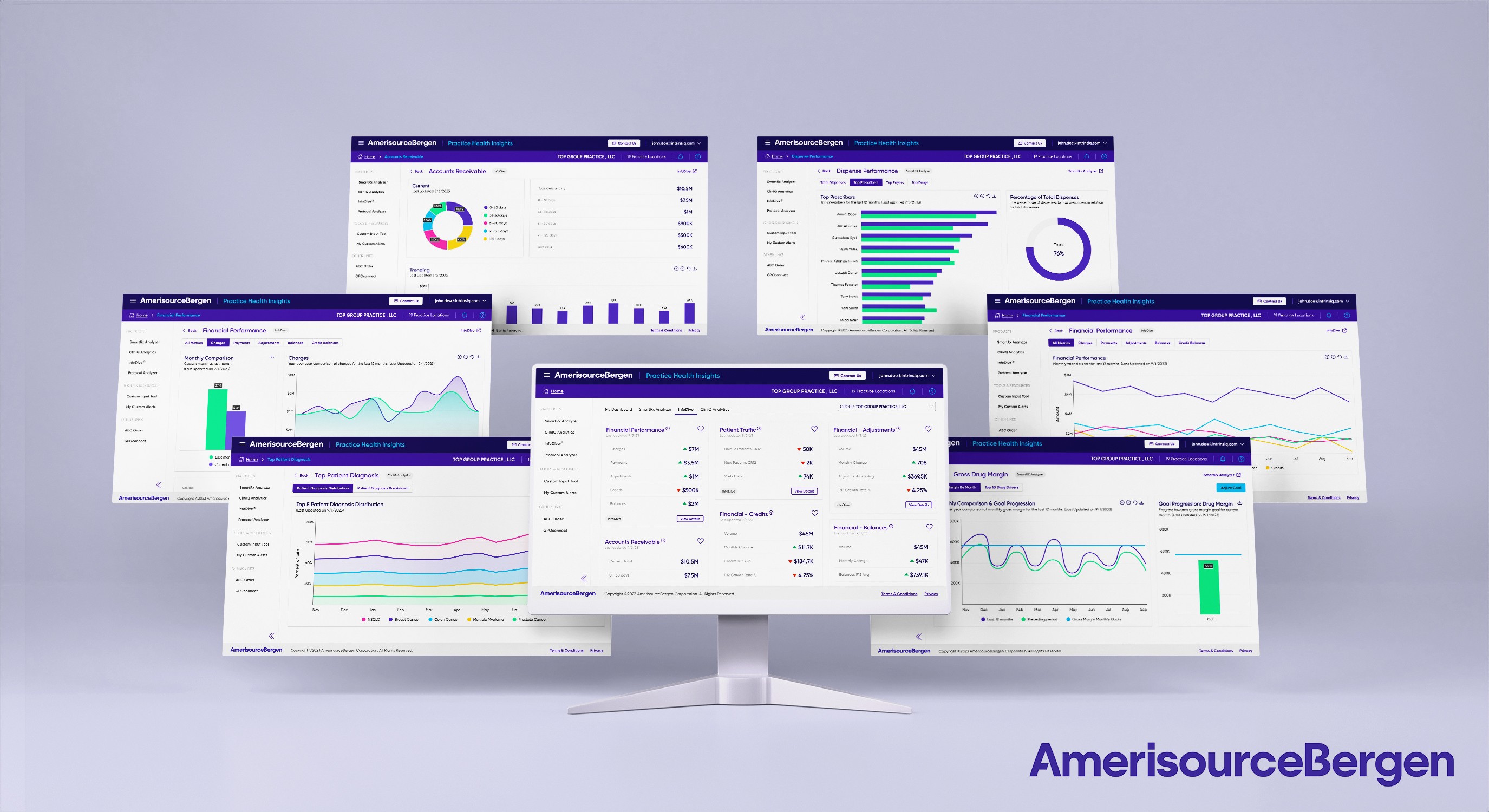
Business Impacts

1

Live Reporting

Replaced static PDF workflows

1

Live Reporting

Replaced static PDF workflows

2

Executive Focus

Built for leadership decisions

2

Executive Focus

Built for leadership decisions

3

Better Insights

Improved data exploration

3

Better Insights

Improved data exploration

4

Workflow Efficiency

Reduced analyst preparation

4

Workflow Efficiency

Reduced analyst preparation

5

Scalable Framework

Adopted across departments

5

Scalable Framework

Adopted across departments

6

Enterprise Trust

Increased confidence in reporting

6

Enterprise Trust

Increased confidence in reporting

my contributions

UX StrategyEnterprise UXExecutive DashboardsData VisualizationProduct StrategyWorkshop FacilitationStakeholder AlignmentInformation ArchitectureCross-functional Leadership